Page 1 of 2

Looking for opinions...

Posted: Fri Mar 27, 2009 6:52 pm
by CheyneX5
I have been brain storming abit lately as to what i want to do with the interior of my NA6.

As it is my daily, i want it to be very tasteful inside but not too over the top, it is already quite nice at the minute with the colour theme being Black, Red and Silver.

The few things i have been contemplating doing are getting some NA8 door cards (without the detatchable speaker grille) and applying some oem "tear drop" sill plates/covers.

Like these:
Image

I will also soon be due for a new dash a mine creaks etc due to a few cracks from the previous owner, so while it is out, i am considering getting a new carpet made up in red, just like the 93' LE's released in the states.

This is still a big decision to make, not just one of those things you can take out in 5 mins.

I did a photochop on one of the photos of my car. Let me know what you all think :D (dodgy photochop ahead)

Image

Thanks Guys!

Cheyne 8)

Looking for opinions...

Posted: Fri Mar 27, 2009 6:59 pm
by hks_kansei
my opinion:

I'm not a fan of the carpet, it's a little too much in my opinion. And also from the point of view of the car being a daily drive, coloured carpet will be difficult to keep stain free.


the door trims look nice, but I think the teardrop parts are a bit too much, can you get just a machined lip for the round speaker grille? similar to the vent rings?

Looking for opinions...

Posted: Fri Mar 27, 2009 7:15 pm
by Fatty
i agree with hks, the carpets would be a bitch to keep clean and are a bit over the top imho. the speaker covers are too blingy for my tastes, too.

i think a few tasty chrome bits like you already have, and red door cards like i have, is about as far as i would go. otherwise it could get too blingy on an otherwise clean, understated car like yours.

but like i said recently, any cosmetic enhancement is entirely up to the tastes of the owner, there is no right or wrong thing to do.

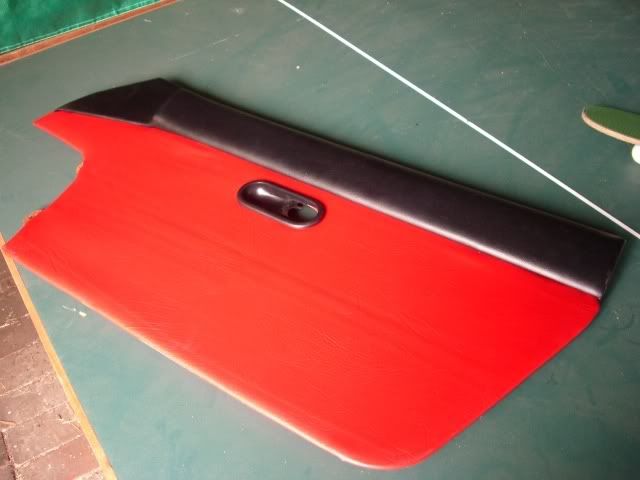
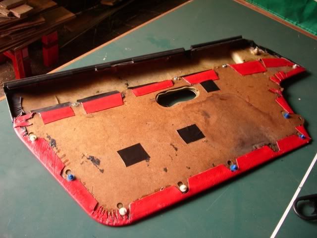
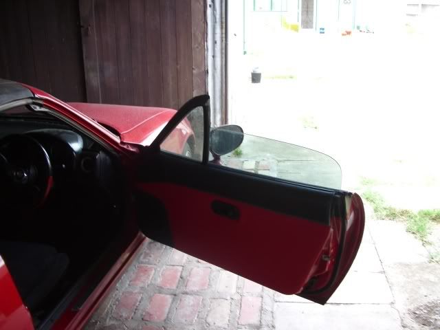
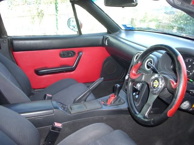
i know you've seen my car but here are some pics of the door cards in case you've forgotten. it's a fun diy job and real cheap too, less than $50.

Image

Image

Image

Image

Looking for opinions...

Posted: Fri Mar 27, 2009 7:30 pm
by philz
Go console less, makes the interior much neater. (keyword- nakamae)

Leave the carpet black and original.

Unless you really want to go red... might be a bit TOO much if you have a red car.

Image

Looking for opinions...

Posted: Fri Mar 27, 2009 8:31 pm
by fattima
Not a fan of the red carpet. I've seen some red carpet fade a bit and get a pinkish look, not good.
I like the speaker covers and reckon they would look good with the your steering wheel.

Looking for opinions...

Posted: Fri Mar 27, 2009 8:38 pm
by wun911
what seat is that?

Looking for opinions...

Posted: Fri Mar 27, 2009 8:53 pm
by CheyneX5
hks_kansei wrote:my opinion:

I'm not a fan of the carpet, it's a little too much in my opinion. And also from the point of view of the car being a daily drive, coloured carpet will be difficult to keep stain free.

the door trims look nice, but I think the teardrop parts are a bit too much, can you get just a machined lip for the round speaker grille? similar to the vent rings?


I see your point, i do have a rule though where i do not eat or drink in my car, stains would not be too much of a problem as i am already quite careful. I must admit though, everytime i look at that photo i made, it's a bit "in your face" to start.

The reason i like it is because it's different and when the doors are closed i think it could blend in quite well.

Another thing i was thinking is that i could get my current floor mats duplicated and make them red with black out line and black text.

As for the teardrop speaker grilles, i think i am going to go with them, i have always liked them.

Fatty wrote:i agree with hks, the carpets would be a bitch to keep clean and are a bit over the top imho. the speaker covers are too blingy for my tastes, too.

i think a few tasty chrome bits like you already have, and red door cards like i have, is about as far as i would go. otherwise it could get too blingy on an otherwise clean, understated car like yours.

but like i said recently, any cosmetic enhancement is entirely up to the tastes of the owner, there is no right or wrong thing to do.

i know you've seen my car but here are some pics of the door cards in case you've forgotten. it's a fun diy job and real cheap too, less than $50.

Image

Image

Image

Image


I do really like what you have done james, makes it look different to the others, which is what i am trying to do. The door cards are nice but not what i am after. Thanks for the suggestion though.

philz wrote:Go console less, makes the interior much neater. (keyword- nakamae)

Leave the carpet black and original.

Unless you really want to go red... might be a bit TOO much if you have a red car.

Image


Now THAT! looks brilliant. If i had a white or black NA, i would go for that look in a heart beat! IMO the nakame console is great but not for the look i am going for, as i meantioned before once the doors are shut it will look better, and seeing it is just the carpet then it should not be too overpowering.

fattima wrote:Not a fan of the red carpet. I've seen some red carpet fade a bit and get a pinkish look, not good.
I like the speaker covers and reckon they would look good with the your steering wheel.


I have had that in mind and am aware that this can happen, you can still get carpet dye though, and it can take quite a while to fade.

Kepp the suggestions coming guys! :D

Looking for opinions...

Posted: Fri Mar 27, 2009 9:47 pm
by Jeo
I like my speaker covers...

Image

Image


I'd LOVE the red interior on my car, but think it would be a bit much on yours. not a devious ploy to keep you away from any that may pop up
or is it :twisted: :wink: :twisted:

Looking for opinions...

Posted: Fri Mar 27, 2009 10:07 pm
by CheyneX5
well joe, your in luck. the mx5 centre has a RED DASH!!! RHD too :mrgreen: They are in vic. Give james a call, cant remember what he wanted for it.

Looking for opinions...

Posted: Fri Mar 27, 2009 10:24 pm
by bensale
On the other hand I quite like the red carpet, very Peugeot 205 gti (and 1980's... :| ) However, in a red car, especially one with no roof I'm not so sure... maybe too much red.

If it were me and I wanted to spend the money I would get every bit of "bling" to be as close to the same finish as possible, would give it a more complete and (sorry Mr. JDM) OEM look.

IMO the only problem with your interior (except the obvious minor isssue you are going to change over) is that you have chrome ish vent rings, a greyish silver gear knob and a brushed alloy steering wheel. Add chrome speaker covers and it be a bit too much (for me at least) If they were all the same finish I think it would look smick.

Looking for opinions...

Posted: Fri Mar 27, 2009 10:53 pm
by CheyneX5
That's Sir JDM to you! :mrgreen:

In all seriousness though, i strongly agree with you about the brushed, chrome and matte theme i have going, i just have no idea how to fix it!!! The steering wheel is worth too much to tamper with, the vent rings look great and the voodoo is polishable, or i could just get a new one.

I wouldnt really call the tear drops "chrome" they have more of a brushed look to me. they are the same design as the scuff plates i have.

Red carpet again does confuse me, one minute i love it, the next... i dont.

I am liking the idea or red floor matts though :D

Looking for opinions...

Posted: Fri Mar 27, 2009 11:02 pm
by philz
wun911 wrote:what seat is that?


Nakamae

Looking for opinions...

Posted: Sat Mar 28, 2009 5:14 pm
by Mr Morlock
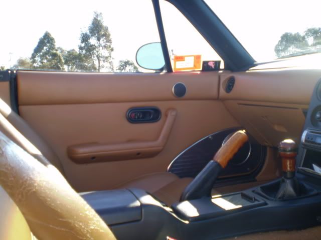
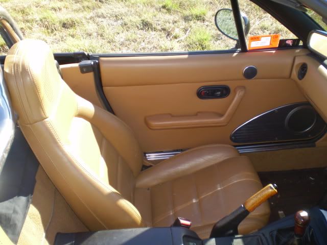
red is an in your face colour and not at all restful. The tan interior pictured would be far easier to live with and some would say more subtle. Reds also are far more prone to fading. The no console seems about as practical as trousers without pockets- looks good but not practical.

Looking for opinions...

Posted: Sat Mar 28, 2009 5:57 pm
by graemebc
our cars are not what you would call practical anyway. I'm a huge fan of that red car, very 60's sports car look interior. Dunno if I could live with it but I love the look.

Looking for opinions...

Posted: Sun Mar 29, 2009 8:09 pm
by Mr Morlock
I took another look at Jeo's interior and it really looks sophisticated and classy in the same vein as many older British cars and I think it would be an easy cockpit to sit in. Many of the modern cars esp the sports versions are decked out with loud colours and gadgets and stripes and spoilers that all cry out" look at me" A friend of mine who was an artist once remarked that red cars make a person agitated and hot and bothered- sounded a little strange but I see the point. If you decorate your house with restful colours it may have the same effect on your moods whilst hot pink maybe not. Depends what camp you are in.